Part 8 of 10: Design for mobile first, then scale up.
Due to the number of organizations using the Temenos platform and our associated analytics, we get to see a broad perspective of account opening experiences in different states and countries. And we have seen a definite trend in the growth of consumers using Smartphones to originate new personal banking products like Deposit Accounts and Credit Cards. In fact, in 2017 for our customers, smartphones became the #1 device used by consumers to apply for bank accounts and credit cards (Desktop is still dominant for business banking and products like Mortgages…but for how long?).
Furthermore, we see higher completion rates on smartphones when compared to completion rates on desktop (when the bank has invested in a mobile/touch-friendly experience).
Finally – ask any designer and they’ll tell you it’s easier to start to a mobile design and scale up rather than start with a design focused on a larger screen and cram things on to a smaller screen. There’s a great 6 part tutorial on the concepts of mobile first design (Lesson 3) and scaling up (Lesson 4) here https://trydesignlab.com/responsive-web-design/lessons/ and as the course author Patrick Wong (https://trydesignlab.com/Patrick/) elegantly puts it…
“…mobile-first design allows us to start with the unique size constraints of a smaller screen, which helps us be brutal about simplifying our content and navigation… instead of simply trying to shoehorn a larger layout onto a smaller screen.”
There are some specific ideas you should consider when designing an bank product application experience for a mobile device and they include (but certainly are not limited to):
|
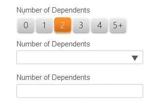
The example here shows 3 ways of collecting the required information – number of dependents. The Toggle Button is the easiest to interact with on a touch screen device – a single tap completes the required information. |
 |
|
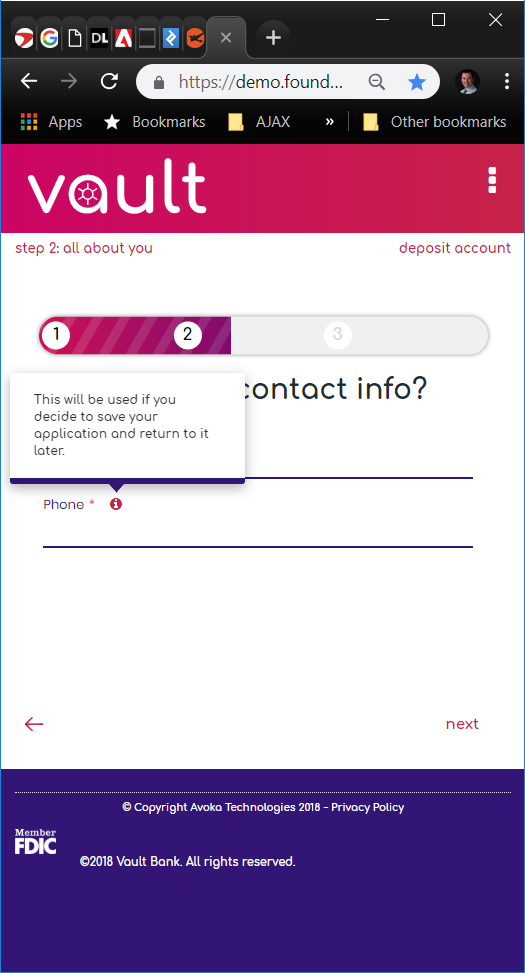
Tooltips Don’t work on Touch Devices Do not display important information on tooltips as hover is not supported on touch devices. Use information icons and if the information is critical, show it 100% of the time. |
 |
|
Use a Single Colum Layout Avoid the potential confusion of different paths through the fields on a form by adopting a single column layout. |
 |
|
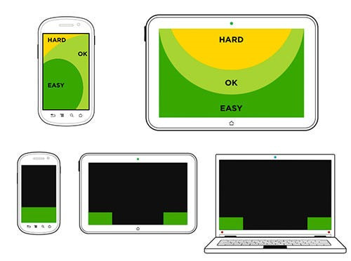
Design around Thumb Reach on Smartphones There are areas that are easy to reach on a smartphone or tablet with your thumb – put areas of interaction (buttons etc.) in those areas and avoid asking the customer to interact with the hard-to-reach areas of the screen. These can be used for menus that are used infrequently. The example here shows a “Send Now” button that spans the width of the screen making it easy to hit. |
|
|
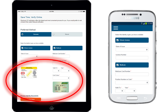
Use adaptive design to eliminate content Smartphones have smaller screens – so adaptive design can be used to change what’s displayed on a smaller screen. Sometimes instead of shrinking something to fit, it is better to remove it. For example – “helper” images like the sample ID document images shown here are better removed from the smartphone form factor through adaptive design. |
 |
|
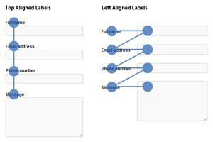
Position labels above fields The image here shows the simpler navigation of the eye when processing an application form with labels positioned above fields as opposed to on the left. |
 |
These are just some of the design principles we recommend for smartphone devices that apply equally well to larger screens. And as mentioned at the start of the article – it’s easier to design for a small screen and scale up, rather than trying to cram a large screen design on to a smaller screen.
When you subscribe to our announcements, we will send you an e-mail when there are new updates on the site so you won't miss them.


