Three Things Banks Can Learn From Airbnb
I always encourage the banks we work with to pay attention to the digital experiences of other banks, but also to the strategies of companies outside banking. Innovative brands like Amazon and Netflix are constantly changing customer expectations of what a frictionless digital experience can look like. Airbnb has earned a reputation (very well earned, in my opinion) for delivering simple, meaningful digital experiences for their traveler and hosts.
I’d like to propose three ways banks can take cues from Airbnb’s excellent digital experience designs to improve the experience for their customers:
-
Heighten aesthetics and visual appeal.
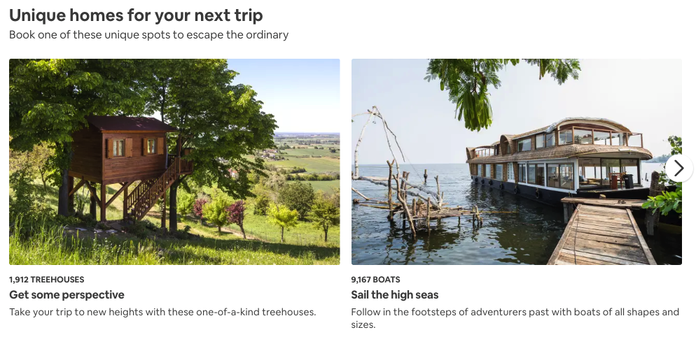
 Airbnb capitalizes on the sensory appeal of travel by featuring inspiring, professionally taken photos of their properties and destinations. They will even send a photographer out to each host’s property to take professional photos.
Digital banking experiences could be brightened in similar ways. What if, as part of a home mortgage application, a photo of the applicant’s desired home is shown throughout their application? Similarly, a picture of the shiny new car being purchased might be shown during an auto loan application, or a picture of Disney’s Magic Castle for a family saving for a Disney vacation. These visual cues help the applicant stay motivated.
-
Minimize complexity
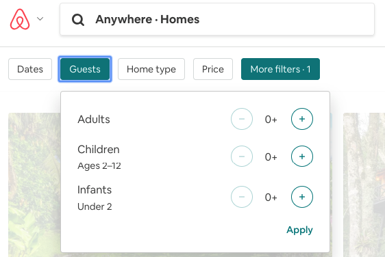
 For me, much of the fun of travel is in the research: exploring different places to stay, looking at maps to get a feel for the place. Airbnb has stripped away much of the complexity of researching different places to stay, asking for just basic attributes of your experience: dates, number of guests, home type, and price range. More complex options (amenities, facilities) are available from the More Filters dropdown, but they aren’t required. Getting started with your trip planning is straight forward and exciting.
 Now I know that banking is more complicated and regulated than vacation planning. I get that. But we’re often mystified by how many banking applications continue to be cluttered by confusing, incredibly detailed series of questions. Take Source of Wealth details as an example. I realize this level of detail may be important, even mandated for some industries or product types. But consider, for example, a deposit product like a CD, where the customer is trying to give the bank money, not borrow from it. Oftentimes, applicants are asked for things like their employer’s industry, employer address, occupation categories (and sub-categories!), and even for a brief overview of their role. Is all of that really necessary to open a deposit account?
-
Provide choice on time and channel.
Airbnb’s mobile experiences (smartphone and tablet) are arguably more enjoyable than their web experience. Particularly on a tablet. The tactile nature of tapping, swiping, and zooming in the native tablet app, coupled with the vibrant photography really engages the senses. Past searches are always saved, available to return to later.
We are starting to see more banks deliver responsive, adaptive experiences through mobile-browser features. Some digital banking product applications, for example, offer the ability to save your application and return to it later. But these attributes are still far from mainstream, and we think they are table stakes for good digital design. Until mobile banking experiences become on par with, and even preferable to, desktop/laptop browser experiences, there is room for improvement.
Great digital experience design helps differentiate a brand from it’s peers. The brands mentioned here are certainly the most buzzworthy, but examples can be found across all industries. Forward thinking bank executives will look for this inspiration and challenge the way banking services are being delivered.
When you subscribe to our announcements, we will send you an e-mail when there are new updates on the site so you won't miss them.

