In this onboarding article (Part 9), we want to focus on design simplicity, not fancy UX widgets.
There are things I WANT to do (eat out, watch a movie, listen to music, spend time with my family, play video games) and things I HAVE to do (file taxes, apply for a loan, visit the dentist). Often it seems the thinking from the first bleeds into the second. Fun, gamification, social, when really what people crave in things they HAVE to do is speed and simplicity.
I’d happily sacrifice my dentist being able to play my favorite playlist from Spotify if the visit was 15 minutes shorter!
The same is true in banking. We often run in to design teams that are working tirelessly to design a particular graphical component for input (a slider, a carousel, a progress bar, a…whatever) and we ask them:

What if we focused that time and energy on removing fields or prefilling information on the application. What if it didn’t look as cool, but could be completed twice as fast?
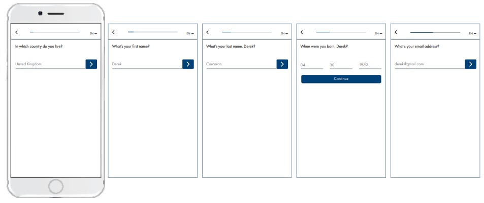
Take a look at the account opening experience from N26 in Europe – a successful and rapidly growing digital only bank. It represents the ultimate in design simplicity. Single field per screen. No scrolling. Plenty of space on the screen for the keyboard when required. Simple progress bar up the top. No Logo. Clear “back” button. It’s so easy to move through the application experience and the design is uncluttered.

Similarly, if you’ve used the Amazon website or app, you’ll notice a distinct lack of fancy design – no 3D rotation of objects. It’s a very simple, even primitive, design. But obviously, highly effective.
So we would encourage you to focus energy on making the application experience simple and uncluttered for applicants. As software usability and design guru Jared Spool famously said:

Is your design getting in the way of people completing the important task at hand (becoming a customer)?
In Part 10, the last article in this series, we look outside banking for inspiration.